Tuesday, February 27, 2007

My blog has moved to VOX

http://jenniferyoon.vox.com/

Finally, I found a blogging service that I am very happy with, thanks to PC Magazine's recommendation. Photo uploading is MUCH faster. Templates look much nicer too! No more extremely large title font!!! I have added 2 new posts, so please go there and check it out. I will write blogs about my StockWiki development effort at my new blog location, as well as continuing to post about my sewing and card crafts. Jennifer Yoon.

Thursday, December 14, 2006

How to decrease your Blog Title Font, Blogger Page Header Font

From Template, HTML Edit, do a find (use your browser's find feature) for "pagetitlefont", change default=from 270% (mine was) to a smaller number, such a 140%. I have changed all "<" to "(" because blogger thought this was an HTML code and wanted to execute it instead of showing it as text.

(Variable name="pagetitlefont" description="Blog Title Font" type="font" default="normal normal 270% Georgia, Serif"
value="normal normal 270% Georgia, Serif")

Google's face lift for Blogger.com

Google unveiled a Beta update version to Blogger.com. It does have a few crucial improvements. When I updated my template, the Title to my Blog become HUGE AGAIN!!!. I found the html code culprit for those SUPER LARGE BLOG TITLE FONT!!!:

From your browser, do a find (Control F), enter "pagetitlefont." It was about 1/4 inch down on my vertical scroll window. Change this to 140%-170%. Now you have sane sized title fonts, FINALLY!!! I also downsized several other title fonts, for the date stamp, post header, post comment etc.

Now that I have (re-)discovered this change, I think my experiment with blogging on Blogger.com is coming to a close. The site still does not give an easy way to make text flow nicely around posted pictures, an easy way to upload a lot of pictures at once (FTP hosting of pictures), and the ability to control text line spacing, padding between design elements etc. FrontPage was really good for these types of static content webpage design (newspaper style). Although FrontPage is not integrated with a database for quickly serving up dynamically changing shopping cart-like material, it was super easy to use and easy enough to make a professionally laid out text and photo pages. I will post a few more events/software reviews, and then move on to a more professionally hosted solution to my blogs. I am also intending to start a more serious blog on finance and investing related to my StockWiki pre-launch company. If anyone is reading, nice to have you along and I'll post a link to my later, more serious blog site. Jennifer


Reviews - Microsoft Visual Web Developer 2005 Express Beta (free)

A few months ago, I wrote about Microsoft Office 2007 Beta and lamented the fact that FrontPage 2003 was not part of the upgraded. I was reading a PC Magazine and one of the articles said that Microsoft's Visual Web Developer 2005 Express Beta was a much better software for newbies who need to put up web pages quickly. So, I went to Microsoft's site and downloaded the FREE beta. It's great that it is free. It also comes with a FREE PDF user's guide https://connect.microsoft.com/Downloads/DownloadDetails.aspx?SiteID=40&DownloadID=240 that looks pretty nice (good use of color), is 244 pages long, and seems pretty thorough. The full software download was a whopping 1.3 GB!

First off, the program is not intended for the same level of ease as FrontPage 2003. You can't just start typing text and inserting pictures. It's more like FrontPage's code-view layout, which I never paid any attention to when I was using FrontPage. However, if you have been doing some html (or xml) coding in the past few years, the Visual Web Developer 2005 Express provides a very nice set of modular boxes (small windows) for you to write your web codes in. Microsoft also included a nicely organized and extensive set of functions (code sets) that you use by simply clicking on drop-down boxes. So, there is no need to remember all the codes. You can just select one by clicking from a list of similar codes. The modular windows also look very well thought out. It really helps organize the process of coding. You can quickly jump around in your data files or in your code sections (or blocks). The modular windows looks a lot like MatLab windows to me. I think the recent year's beta products have been much nicer in ergonomics/process organization than their previous products. Maybe the new guy is making the difference in product design. Sorry Bill, but Ray Ozzie may have a finer touch ; )

I haven't actually built any web pages using it yet. I think I will read the user's guide first. The program is much more extensive in features (it is a full blown web development program behind all the built-in wizards), so it will take longer to get a handle on it than FrontPage. I am also learning Adobe's Flex2 for developing client-side user interface. Flex2 is VERY easy to use. It also has modular windows. You can drag and drop objects such as table, text box, checkable list box, graphics etc. Flex2 may be easier at coordinating color and font styles than Visual Web Developer Express. But Flex2 does not also integrate with the backend server-side and database interface, which the Microsoft's Web Developer does. I'll post an update of actual user experience from an amateur web developer in a couple of months.
http://msdn.microsoft.com/vstudio/express/vwd/

Thursday, November 09, 2006

Sartup Camp, Silicon Valley, Nov 2-3 2006

Hi, I had a very productive two days at Startup Camp. It was held at the computer history museum. It's too bad I only had time for a quick look at the exhibits. I met a lot of interesting people starting tech businesses in the area. Wordpress founder was there in person. I was shocked at how young he was. The best startup competition was won by a landslide by an 18 year-old one-man developer for Zoomr.com Wow is all that I can say. I feel very over-the-hill after meeting him. I met several interesting people that I hope to be able to keep as friends for the long-haul. About 400 people seem to have attended. I've added my comments to 2 sessions that seems to be popular, so I am adding a link to them on this blogpost. Enjoy.

http://wiki.startupcamp.org/wiki/UserAcquisitionRetention

http://wiki.startupcamp.org/wiki/BusinessNetworking

Also, this link takes you directly to all the comments attendees have been posting after the event.
http://wiki.startupcamp.org/wiki/Special:Mostrevisions

Tuesday, September 19, 2006

Hiking with Friends

Here we are after getting lost for 2 hours. We started on Baron Cameron Avenue inside Lake Fairfax and ended up at Lake Anne. We were happy to see the outside after being in the woods.


Monday, September 18, 2006

House on Venice Canal, California


IMG_0714
Originally uploaded by Jyoon Crafts.

Some photos from my recent trip to visit Jason, my brother, in L.A. His friend, Kirsten Rose join us on a day at the Venice Beach, CA. The photos are from Venice Canal, which is really pretty. JY ----------------------

I used Flickr's "Blog This" feature to post this photo to Blogger.com. This feature allows only one photo to be linked to blogger, but if the reader clicks on the photo, the rest of the photo account can be viewed. So Flickr's blogging is not an independent full-featured blog software, as I had initially thought. Loading multiple pictures is still easier using Flickr, but users still need an account with a blogging service (such as Blogger.com or WordPress.com).

Review – Microsoft Office 2007 Beta, blog posted using Word 2007 Beta

I have tested the Microsoft Office 2007 Beta components, and here are my reviews.

Summary:

  • OneNote 2007 - a MUST upgrade if you use OneNote 2003.
  • Word 2007 - a pleasing upgrade if you like better looking and better organized formatting menus
  • Internet Explorer 7 (not part of the Office, but just thought to include it here) - a very nice upgrade. Pleasing to look at, more features, better security. Does not support Yahoo Mail, except via a registry edit by the user.
  • Excel 2007 - still not reviewed. Cannot see what is different right off the bat. Not compatible with 3rd party plug-in and web mesh-ups.
  • Publisher 2007 - not recommended. Use FrontPage 2003, or templates provided by web-based services.

OneNote 2007 Beta -- I REALLY LOVE this upgrade.

This is a much needed upgrade to round out the rough spots in the earlier version of OneNote. Now you can have more than 1 notebook, there is an “explorer” like view to organization of notebooks and pages by dragging them around, and the much needed table feature has been added. There is also a web browser button that will add web clippings directly into OneNote’s unfilled pages section. In my opinion, the 2003 OneNote was a beta software, and the changes to 2007 OneNote finally make this software a full featured offering.

Outlook 2007 Beta – not much change, slightly better look.

The 2007 Outlook has a slightly better looking business card view. The ability to see the task plane in the calendar view is nice. Has one-button integration with OneNote, which is nice if you use it.
Recently, I printed a 5x7 sized address book from Outlook. It printed a nice directory with "a..b" etc legends along the right-edge of page.

It had compatibility issues when I upgraded to IE 7 and also with a few other providers. It also does not like having Outlook 2003 installed at the same time as 2007. The corrupt files seems to have repaired itself from the original install files (since I no longer know where the install CD is).

Generally, I really dislike Microsoft Outlook. After killing off Lotus Organizer back in 1996(?), I have yet to find a version of Microsoft Outlook that worked as well. The only feature I use consistently in Outlook is Contacts, and this only because I need to sync with my Microsoft PocketPC’s Contacts. However, Outlook 2007 Contacts does NOT sync with my Pocket PC 2002 Contacts. I may start looking around for a contact management software with better organized contact fields, better user interface, much better handling of duplicate entries, and better syncing directly to the storage card on the pocket pc -- and ditch Microsoft Outlook altogether. It will be good riddance! Bye bye Outlook! Bye bye to countless hours wasted manually correcting sync error!!!

Word 2007 Beta – much improved organization of formatting options. Worthy upgrade if you do a lot of complex formatting.

The look is very different than Word 2003. Similar tasks are grouped together. Menu bar section has become a menu ribbon and takes up a large real estate at the top of the screen. There is a context sensitive mini-popup-menu. Just select the text you want to edit and right click.

I posted a sample of this page directly to blogspot.com using the new “Blog Post” function. It worked surprisingly well! Bloggers might want to upgrade just for that function. I have recommended to a small business an office wide upgrade to Word 2007 when the final version comes out.

----- Update: OK, the test image did not upload correctly using the built-in "Blog Post" function fromWord 2007. Still, that's not bad. Just getting the text to format correctly and uploading with 1-click to Blogspot.com is worth getting excited about. ---------

Publisher 2007 Beta (no FrontPage 2003 upgrade available):

O.K., I think I know why there is no FrontPage 2007. WordPress and TypePad seem to have taken over the blogging domain and personal/small business web hosting services seem to have taken over everything else. Each web hosting provider offers web templates, complete with graphics, for the novice web user. The experienced users seem to write code directly into PhP, Java, Ruby on Rails, and Rails scaffolds. FrontPage 2003 seems to be redundant, and not too many people are using it anymore.

I still use FrontPage 2003. I am sorry Microsoft did not choose to upgrade it. When FrontPage 2003 came out, it was a big improvement over 2000 because 2003 allowed multiple views of the page being edited. A (web) preview and (html) code screens can be viewed simultaneously in a tile format, which saved a lot of time. I like the built-in template for a photo montage and photo film-strips. But Flickr and SiteKreator.com both offer these templates. Still, if you have a photo edition & managing software on your desktop, it's MUCH faster to create such a photo montage on the desktop. You may need to downsize them and edit them a few times, and uploading/refreshing each edit takes a long time on these websites. If you have FTP ability on the web, it's fast and a one-click operation to load the templates and all of the edited photos in one fell swoop.

Publisher is for printing business cards, photo calendars, and greeting cards. I exclude brochures from this list because Microsoft Word has very good templates for printing business brochures and complex 100 page reports with pages of footnotes, as it should.

Excel 2007 Beta – 3rd party plug-ins not compatible. To be reviewed.

Update - Internet Explorer 7 review:

I use a Yahoo Mail paid service. When I click an e-mail link from a websites, ex. Linked-In.com, the browser fires up a "mail client" on the desktop. The Internet Explorer (all versions after 4) requires the user to go into the registry to add a "mail client" other than Outlook. I found instructions on support.microsoft.com to make this registry edit, but it's really lame of Microsoft to require this. I use the Yahoo mail and use the browser to directly read and reply to e-mails. I only download e-mails to archive them on my desktop and then delete them from Yahoo's servers. I really like Yahoo's built-in virus scanner, spam filter, and auto direct to my folders for news and shopping emails. I have not gotten a virus infection in many years. In general, I like the nice look, better security, and enhanced Google button choices of Internet Explorer 7, so I will probably do the registry edit and keep IE as my browsers, but will spend more time checking out Firefox to see if the integration to Yahoo Mail is easier. It seems strange that IE 7 has Google Mail & services buttons but not Yahoo Mail & services buttons.


Tuesday, September 12, 2006

Jennifer Yoon's Review of Blogging Services, Free Personal Websites, Software on the Web

I came across an extended discussion of blogging software by veteran bloggers. The general consensus seems to be -- that Blogger.com & Blogspot.com was very bad and WordPress is the best for serious bloggers (the ones who want a following). TypePad got 2nd choice for ease of use. WordPress seems to require some investment in time to learn some new software & codes, but a lot of good tutorials are supposed to be available and it's definitely not just for programmers. WordPress is said to be a do-it-yourself project, but also gives full control over the design/look of your blog.

http://www.problogger.net/archives/2006/07/12/what-would-i-do-different-if-i-had-to-start-my-blog-over-duncan-riley/
http://www.problogger.net/archives/2006/07/16/1-question-interview-index-page/
http://wordpress.org/
http://www.sixapart.com/typepad/

I am writing this and other negative reviews of Blogger.com right on my Blogger blog. So, at lease it's proof the company is not sensoring anything. My main complaint is that it is difficult to make my blog look anywhere near nice looking using layout, font sizes, and image uploads. It's very slow and often freezes, losing my edits. Others mention SPAM from blogspot.com's comments section as their number one problem. I don't have this problem, even though I have the comments turned on.

I've tried out the Flickr for uploading multiple images. Flickr IS a well executed, nice looking site, with a fun way of forming "groups" to pool public photos by topic/tags. I had a lot of fun looking at handmade cards and sewing & craft photos. Flickr also offers simple blogging, which may be MUCH more preferable if you want to blog with a lot of pictures, like I do.
http://flickr.com/photos/jyoon/ (my sample photo of cards on Flickr)
http://flickr.com/search/groups/?q=craft%20cards%20handmade&w=15834567%40N00&m=pool (a serach result for craft, cards, handmade on Flickr)

Best looking FREE website I've come across is SiteKreator.com. They have enough templates to choose from for that your site can look good. The only drawback is that the free version comes with only 10 MB of storage, but 100 MB is only $20/year. Of course, you can also create a blog. The "passing through India" blog had BEAUTIFUL photos from all over India. It's travel without leaving your desk. The added benefit of SiteKreator is the multiple location hosting. In the unlikely event that your blog/website becomes famous, it will still serve up pages to tens of million of your newfound friends.
http://sitekreator.com/sitekreator/personal_edition.html
http://sitekreator.com/passingthroughindia/index.html

A very good collaborative web service for a small group to share calendar, to do lists, project files, and divying up tasks among co-workers is CollectiveX. Users can also edit word-type of documents online, though the features are a bit basic.
http://www.collectivex.com/

A service that I LOVE is Zoho's spreadsheets. It has 300 functions including almost all statistical and financial functions built-in (this is comparable to Excel's data analysis pack plug-in). So far, I have not found any function lacking for financial statement analysis. It is not customized for stock investment analysis like StockWiki's spreadsheet will be, but this sofware has all the basics we hope to offer on our site and it looks great too. It's said to be a tad slow and loses edits when 2 people are editing the same spreadsheet simultaneously. I supposed it would work fine if the 2 people take turns editing (every other day), which will be closer to real usage.

Others rave about Zoho's word processor. They seem to offer other Microsoft Office like applications over the web. I think you should definitely check it out if you are interested in alternative Office-like apps, especially if you need to work with someone over the web and usually e-mail documents back and forth.
http://www.zohosheet.com/home.do

That's it for now. I have more neat software I've found, but will post about them later.

Bill's Cast

Bill got a cast from playing football with B-School friends over the weekend. Posted by Picasa

Bill's hand made birthday card - Buffalo Hunter Happy Birthday


Hi, I made this card for Bill's 42nd, THE answer to Life, Universe, and Everything! We had a quiet dinner together to celibrate both of our birthdays together at a local restaurant.

Saturday, August 05, 2006

One more card, Tulip


Tulip I love this one also. Stamp is by Anna Griffin. It was rather difficult to get this look. I experimented with several inks. Finally I used pink passion pigment ink from Stampin' Up on the tulip, and then LIGHTLY penciled in edges of petals with watercolor pencils to emphasize and darken them; then LIGHTLY smuged inside the petals with a damp sable brush (no. 2 round). Brushing water or permanent markers onto the stamp did not work well.

I used Picasa to upload this picture. Only one picture can be loaded at a time using "Blog This" button. Works well. Blogger.com's own Picture-Icon for loading pics no longer seems to work at all.

Tuesday, August 01, 2006

Blogger complaint

I was not able to reproduce the nice layout I had made using FrontPage 2003 onto my blog posts. Blogger would not accept frontpage's tagging, so none of the nice "filmstrip" layout I had made, or any of the formatted headers and description of each card made it onto my blog. I cut and pasted some of the cards and their description, but it does not look as nice. Also, blogger repeatedly failed to upload a picture, even though I received the "done" message. Eliminating extra space and moving the pictures were difficult. Blogger lost my pictures many times when I tried to move them a bit. I had to upload each pictures several times. Pages also froze often.

I really don't think this is ready for prime time. But, many others seem to like it a lot. Else Blogger.com would not have received so much free publicity. - jyoon

Jennifer Yoon's hand made cards

A version. I really like this dragon. It has a graphic, bold quality. Don't remember who made it.

This one I will leave as is. Looks very dramatic without any coloring. Stencil by All Night Media.

This one uses quite a lot of different coloring. I was not able to be fully satisifed. I used Ranger's Perfect Pearls turquois powder applied with water dampened brush. It warped the card a bit. I pened in shadows around outer wings with Sakura silver gel pen and blue ink marker. Lettering uses All Night Media plastic stencil and blue ink pad applied with a flat stencil brush.


The apricot cardstock used in this card is a really beautiful color. I think the stamp was All Night Media, but I am not sure. Stamp is very beautiful and looks wonderful in many simple designs. I think I like elaborate and intricate designs in general rather than casual and breezy ones. Ink is metallic red pigment from All Night Media. It shines more than ANY OTHER INK. Plus it's only about $3.00 - cheaper than a reinker. It takes a LONG time to dry -- at least a day, maybe a week. It never dries on vellum even after months. Embossing with clear or sparkle powder is recommended for matt paper and required for glossy paper. I don't emboss. I don't mind just letting it air dry for a couple of days on matt cardstock. I love the colors and shine. BUT, it does stain the stamp, which I DO mind. Oh well. I even used StanzOn all purpose cleaner for solvent & other inks, but it still stains the rubber. The background paper was nice too with toning leaves printed on it.

Jennifer Yoon's hand made cards & technique

July 2006 ~ December 2005


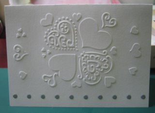
Here are pictures of my handmade cards. I have started making cards since December 2005. Alisa Yu introduced me with Stampin' Up. Since then, I have branched out into other designers and various methods. I love many of the ones showcased here. Ochida asked me to post photos of my cards. So here is my attempt at combining this post with learning to use Blogger.com. I have used Microsoft FrontPage 2003 to layout this web page (after a dismal attempt at using a free page layout template provided by Blogger.com).


Note: Most of the cards in this group uses Crane & Co.'s 100% cotton paper, pre-packaged with stenciled dots along the bottom. This is my favorite paper for dry embossing. The embossed designs really pop out because it's a bit thinner than other cardstock, yet the paper is very strong due to the cotton fiber and will not rip. My favorite brass stencils are from Dreamweaver Stencils, but a few I love are also from All Night Media.


( *** I buy from StencilswithStyle.com (Love this place); PlaidOnline.com (for All Night Media and Anna Griffin, very slow shipping but better search and product info); AddictedtoRubberStamps.com (very fast shipping but expensive and very slow search function); and eBay for used Stampin' Up stamps. *** )


Enjoy. Jennifer Yoon


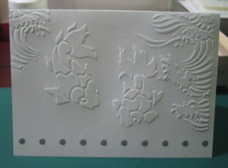
Koi. One of my favorite!
This one turned out really beautifully! I sent it to Ochida. I used Billiance pearlescent inkpads applied with Fantastix brush-tip foam applicator. Koi design by Dreamweaver Stencils (www.stencilwithstyle.com -- love this company); paper 100% cotton thin pre-made cards from Crane


I have added waves (stencil by Dreamweaver Stencils) to Koi. It looks dramatic without any coloring. I can't decide if I will leave it as is or touch up with a few focal points of coloring.

Jennifer Yoon User Review of Blogger.com and blogging

This is actually not at all easy to use. It takes forever to upload pictures. It's like pulling finger nails off of a female prison torture victim. Yeee-yikes! I will just have to figure out how to get my own website working again (don't know who has the password for admin privileges anymore). And get FrontPage 2003 to work again and play nice with me. Microsoft apps keep asking for the original CD even after I thought I specified full install. Next time, I will make an image CD and keep that along with the passkey digits. I don't know where the CD is for FrontPage 2003, although I do have the passkeys (since Word 2003 etc. are already installed I can look it up as part of the Office Prof 2003 package). I've moved recently cross country... so have not found, reinstalled, organized all things yet.

Blogger's free templates make headers WAYYYYY toooo BIGGGGG! I tried to see if I can manually change it to something close to normal size, but I can't find the Html code for font size on blog titles. I can't place the pictures on the page where I want to. It's difficult to manipulate placement. Other people's blogs look SOOOOO MUCH NICERRRR. I'm definitely sure they did not use the built-in editor to create their blog posts (at least not the free one). I need to find a free web hosting site for pictures and text that is better at providing page layout tools and more sane free page templates. Maybe the title fonts are so big in order to score higher on the Ad Sense rankings. It makes for a poor looking template.

I tried to use Mambo a while back, but it got merged, then overwhelmed by users, then relauched and lost some archieved data... Anyway, I am not a programmer and it was too daunting a task to learn a new language just to write my personal webpages on Mambo.

I will stick with FrontPage 2003 until I can devote more time to learning Ruby, Rails and MySQL at the same time. Wait--, Bill told me about Adobe Flex2 using Flash 9. It looked a lot like a FileMaker development & template environment. (I love developing on FileMaker and have been supporting my Dad's business database on it for 20? years now). Flex2 has rectagles and text boxes that I can drag and drop. Fonts can be chaged from a drop-down menu. This might be a solution for non-programmer like me. Although, I am not a total newbie because I was editing on DOS text editor and programming on AutoCAD and Lotus123 long before Windows 3.1. But it seems that everything I know is at a MUCH lower level (machine code Intel 8088/80286, VLIW when that was done only on supercomputers), and so it does not seem to help at all in this web progamming age. I keep expecting it to be easy to publish a web page, but it isn't yet. On the desktop, applications to create a simple Word document with embedded pictures and text that flow around the pictures are easy as cake to create. Why isn't it similarly easy on the web?

I guess it will become that easy, but just not yet.
Even machine language had quite a bit of time to develop. Boolean algebra may have been around since late 1800's and the Disk Operating System (stored on a floppy disk) also had been around for good number of years by the time I was using them in early 1980's.

Waiting for it to get better... going to see if I can find get the Admin privilege on my personal website... Looking to do more unpacking and organizing per David Allen's GTD.
- JY

Update: saw SiteKreator. Has much better free templates and seems easier to control page layout of pictures. Limited to 10 MB only on the free account. Will check it out for my personal websiter. -- JY

Blog test2. Ahem, a bit more mature.

Hi, I will attempt to post pics of my hand-made cards now.

OK, that was a failure. My SD card with the pics made it to Bill's office. Here are some other pics instead. JY


Some pics of the silk pillows I made for Susan Pan.


Kungfoo fighting cats.


---->>>> Life imitates Art.


This is Bill, when his hair was orange.


This is me at Shenandoah last Autumn.


testingtes

test1